
 读者投稿
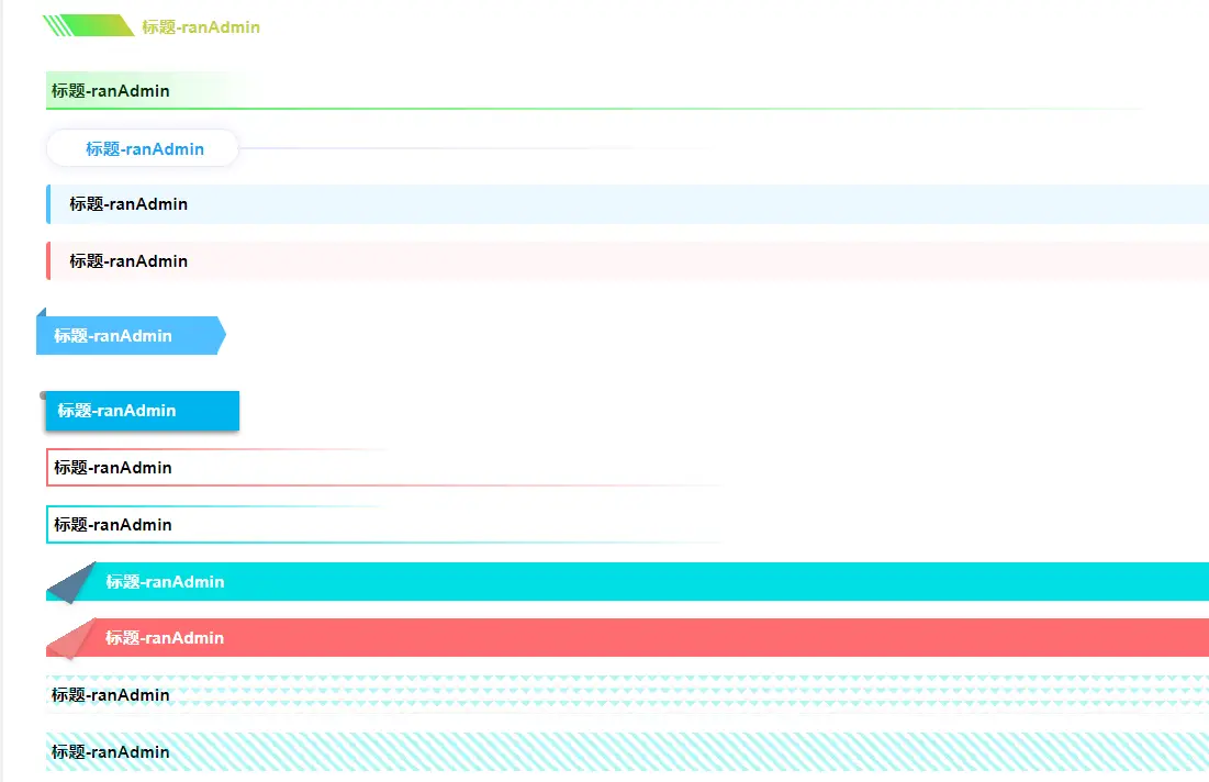
读者投稿 超好看的18款纯 css 标题栏,你值得拥有
AI 概述
<template>
<div class="titleContent">
<!-- <div class="title1" data-color="red"></div> -->
<div :class="'title title'+value" :data-text="'标题-ranAdmin'+value" v-for="value in 18" :key="value">
标题-ranAdmin</div>
...
<template>
    <div class="titleContent">
        <!-- <div class="title1" data-color="red"></div> -->

        <div :class="'title  title'+value" :data-text="'标题-ranAdmin'+value" v-for="value in 18" :key="value">
            标题-ranAdmin</div>
    </div>
</template>
<script setup>

</script>
<style lang="less">
    .titleContent {
        >div {
            margin: 15px;
        }
    }

    .title {
        height: 32px;
        font-weight: 600;
        line-height: 32px;
        margin-left: 5px;
        padding-left: 5px;
        position: relative;
        color: #000;
        z-index: 0;
    }

    .title1 {
        padding-left: 15px;

        &:after {
            content: " ";
            width: 4px;
            height: 20px;
            background: #12a3f5;
            position: absolute;
            left: 0;
            top: 6px;
            border-radius: 2px;
        }
    }

    .title2 {
        padding-left: 15px;

        &:after {
            content: " ";
            width: 8px;
            height: 8px;
            border-radius: 50%;
            background: #12a3f5;
            position: absolute;
            left: 0;
            top: 12px;
        }
    }


    .title3 {
        &:after {
            content: " ";
            position: absolute;
            bottom: 0;
            left: 0;
            position: absolute;
            height: 2px;
            width: 100%;
            background: linear-gradient(to right, #01DFE3, rgba(255, 255, 255, 0));

        }
    }


    .title4 {
        &:after {
            content: attr(data-text);
            position: absolute;
            display: inline-block;
            bottom: -8px;
            left: 5px;
            opacity: 0.2;
            z-index: 0;
            text-align: right;
            transform: rotateY(30deg);
            transform: scaleY(30deg);

        }
    }


    .title5 {
        color: #10faf8;
        padding-left: 80px;
        line-height: 22px;
        position: relative;
        border-bottom: 2px solid linear-gradient(to right, #01DFE3, rgba(255, 255, 255, 0));

        &:after {
            content: "";
            position: absolute;
            bottom: 0;
            top: 0;
            left: 18px;
            width: 50px;
            height: 18px;
            transform: skewX(35deg);
            background: linear-gradient(to right,
                    #2d83fa,
                    #10faf8);
        }

        &:before {
            content: "|||";
            display: inline-block;
            font-weight: 900;
            color: #FFF;
            line-height: 30px;
            font-size: 18px;
            position: absolute;
            position: absolute;
            top: -8px;
            left: 0;
            color: #2d83fa;
            transform: skewX(35deg);
        }
    }

    .title6 {
        color: #C6D039;
        padding-left: 80px;
        line-height: 22px;
        position: relative;
        border-bottom: 2px solid linear-gradient(to right, #01DFE3, rgba(255, 255, 255, 0));

        &:after {
            content: "";
            position: absolute;
            bottom: 0;
            top: 0;
            left: 18px;
            width: 50px;
            height: 18px;
            transform: skewX(35deg);
            background: linear-gradient(to right,
                    #4BF15A,
                    #C6D039);
        }

        &:before {
            content: "|||";
            display: inline-block;
            font-weight: 900;
            color: #FFF;
            line-height: 30px;
            font-size: 18px;
            position: absolute;
            position: absolute;
            top: -8px;
            left: 0;
            color: #4BF15A;
            transform: skewX(35deg);
        }
    }

    .title7 {

        &:after {
            content: "";
            position: absolute;
            bottom: 0;
            top: 0;
            left: 0;
            width: 180px;
            height: 100%;
            opacity: 0.3;
            background: linear-gradient(to right,
                    #4BF15A,
                    #4bf15900);
        }

        &:before {
            content: " ";
            position: absolute;
            bottom: 0;
            left: 0;
            position: absolute;
            height: 2px;
            width: 100%;
            background: linear-gradient(to right, #4BF15A, rgba(255, 255, 255, 0));
        }
    }

    .title8 {
        border-radius: 16px;
        border: 1px solid #e8e9fb;
        box-shadow: 0 0 10px #e8e9fb;
        text-align: center;
        width: 160px;
        color: #12a3f5;

        &:before {
            content: "";
            width: 300%;
            height: 2px;
            background: #e8e9fb;
            position: absolute;
            top: 15px;
            left: 100%;
            background: linear-gradient(to right, #e8e9fb, rgba(255, 255, 255, 0));
        }
    }

    .title9 {
        background: #ECF8FF;
        border-top-left-radius: 5px;
        padding-left: 20px;

        &:before {
            content: "";
            border-top-left-radius: 5px;
            border-bottom-left-radius: 5px;
            width: 4px;
            height: 100%;
            background: #50BFFF;
            position: absolute;
            top: 0;
            left: 0;
        }
    }

    .title10 {
        background: #FFF6F7;
        border-top-left-radius: 5px;
        padding-left: 20px;

        &:before {
            content: "";
            border-top-left-radius: 5px;
            border-bottom-left-radius: 5px;
            width: 4px;
            height: 100%;
            background: #FE6C6F;
            position: absolute;
            top: 0;
            left: 0;
        }
    }


    .title11 {
        display: inline-block;
        position: relative;
        width: 150px;
        height: 32px;
        line-height: 32px;
        padding-left: 15px;
        background: #50BFFF;
        left: -8px;
        color: #FFF;

        &:before {
            content: "";
            position: absolute;
            height: 0;
            width: 0;
            border-bottom: 8px solid #4396c5;
            border-left: 8px solid transparent;
            top: -8px;
            left: 0;
        }

        &:after {
            content: "";
            position: absolute;
            height: 0;
            width: 0;
            border-top: 15px solid transparent;
            border-bottom: 15px solid transparent;
            border-left: 8px solid #50BFFF;
            right: -8px;
        }
    }

    .title12 {
        position: relative;
        width: 160px;
        padding-left: 10px;
        // top: 15px;
        // padding: 8px 10px;
        background: #00B3ED;
        box-shadow: -1px 2px 4px rgba(0, 0, 0, 0.5);
        color: #FFF;
        // height: 40px;

        &:before {
            position: absolute;
            content: "";
            display: block;
            width: 7px;
            height: 100%;
            padding: 0 0 7px;
            top: 0;
            left: -7px;
            background: inherit;
            border-radius: 5px 0 0 5px;
        }

        &:before {
            position: absolute;
            content: "";
            display: block;
            width: 5px;
            height: 5px;
            background: rgba(0, 0, 0, 0.35);
            bottom: -5px;
            left: -5px;
            border-radius: 5px 0 0 5px;
        }

    }

    .title13 {
        border-left: 2px solid #FE6C6F;

        &:after {
            content: " ";
            position: absolute;
            bottom: 0;
            left: 0;
            position: absolute;
            height: 2px;
            width: 60%;
            background: linear-gradient(to right, #FE6C6F, rgba(255, 255, 255, 0));
        }

        &::before {
            content: " ";
            position: absolute;
            top: 0;
            left: 0;
            position: absolute;
            height: 2px;
            width: 30%;
            background: linear-gradient(to right, #FE6C6F, rgba(255, 255, 255, 0));
        }
    }

    .title14 {
        border-left: 2px solid #01DFE3;

        &:after {
            content: " ";
            position: absolute;
            bottom: 0;
            left: 0;
            position: absolute;
            height: 2px;
            width: 60%;
            background: linear-gradient(to right, #01DFE3, rgba(255, 255, 255, 0));
        }

        &::before {
            content: " ";
            position: absolute;
            top: 0;
            left: 0;
            position: absolute;
            height: 2px;
            width: 30%;
            background: linear-gradient(to right, #01DFE3, rgba(255, 255, 255, 0));
        }
    }

    .title15 {
        color: #FFF;
        padding-left: 50px;
        background: linear-gradient(-210deg, transparent 1.5em, #01DFE3 0);

        &::before {
            content: '';
            display: block;
            width: 1.73em;
            height: 3em;
            position: absolute;
            background: linear-gradient(-60deg, #577b98 50%, transparent 0);
            left: -3px;
            top: 0;
            border-bottom-left-radius: inherit;
            transform: translateY(-0.5em) rotate(30deg);
            transform-origin: bottom right;
            box-shadow: .2em .2em .3em -.1em rgba(0, 0, 0, .15);
        }
    }

    .title16 {
        color: #FFF;
        padding-left: 50px;
        background: linear-gradient(-210deg, transparent 1.5em, #FE6C6F 0);

        &::before {
            content: '';
            display: block;
            width: 1.73em;
            height: 3em;
            position: absolute;
            background: linear-gradient(-60deg, #f18384 50%, transparent 0);
            left: -3px;
            top: 0;
            border-bottom-left-radius: inherit;
            transform: translateY(-0.5em) rotate(30deg);
            transform-origin: bottom right;
            box-shadow: .2em .2em .3em -.1em rgba(0, 0, 0, .15);
        }
    }

    .title17 {
        &:after {
            content: " ";
            position: absolute;
            bottom: 0;
            left: 0;
            position: absolute;
            height: 100%;
            width: 100%;
            animation: animation3 1s linear infinite;
            background: linear-gradient(135deg, #01DFE3 0.25em, transparent 0.25em) -0.5em 0, linear-gradient(225deg, #01DFE3 0.25em, transparent 0.25em) -0.5em 0, linear-gradient(315deg, rgba(238, 161, 99, 0.25) 0.25em, transparent 0.25em) 0 0, linear-gradient(45deg, rgba(238, 161, 99, 0.25) 0.25em, transparent 0.25em) 0 0;
            background-size: 0.75em 0.75em;
            opacity: 0.3;

        }
    }
    .title18{
        &:after {
            content: " ";
            position: absolute;
            bottom: 0;
            left: 0;
            position: absolute;
            height: 100%;
            width: 100%;
            opacity: 0.3;
            animation: animation2 1s linear infinite;
            background: repeating-linear-gradient(45deg, #01DFE3 0, #01DFE3 0.25em, transparent 0.25em, transparent 0.5em);
            background-size: 0.75em 0.75em;
        }
    }
</style>
以上关于超好看的18款纯 css 标题栏,你值得拥有的文章就介绍到这了,更多相关内容请搜索码云笔记以前的文章或继续浏览下面的相关文章,希望大家以后多多支持码云笔记。
 微信
微信 支付宝
支付宝声明:本文来自互联网用户投稿,该文观点仅代表作者本人,不代表本站立场。本站仅提供信息存储空间服务,不拥有所有权,不承担相关法律责任。
如若内容造成侵权/违法违规/事实不符,请将相关资料发送至 admin@mybj123.com 进行投诉反馈,一经查实,立即处理!
重要:如软件存在付费、会员、充值等,均属软件开发者或所属公司行为,与本站无关,网友需自行判断
码云笔记 » 超好看的18款纯 css 标题栏,你值得拥有
如若内容造成侵权/违法违规/事实不符,请将相关资料发送至 admin@mybj123.com 进行投诉反馈,一经查实,立即处理!
重要:如软件存在付费、会员、充值等,均属软件开发者或所属公司行为,与本站无关,网友需自行判断
码云笔记 » 超好看的18款纯 css 标题栏,你值得拥有


