
 码云笔记
码云笔记 css3实现好看的气泡按钮动画特效
AI 概述
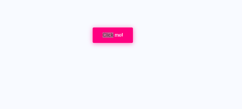
CSS3 在我们网页设计中是最关键的一环,为什么这么说呢?我们在浏览别人的网站时,经常会看到特别好看的动画效果,比如一个按钮啊,一个图片啊,每次看到都能够让人有种赏心悦目的感觉,这就使网站更具有吸引力和互动性。接下来我就用 css3 的一些属性来完成点击按钮气泡动画特效。
先看 gif 效果图:
是不是很酷炫,哈...
CSS3 在我们网页设计中是最关键的一环,为什么这么说呢?我们在浏览别人的网站时,经常会看到特别好看的动画效果,比如一个按钮啊,一个图片啊,每次看到都能够让人有种赏心悦目的感觉,这就使网站更具有吸引力和互动性。接下来我就用 css3 的一些属性来完成点击按钮气泡动画特效。
先看 gif 效果图:
是不是很酷炫,哈哈,别着急,干货马上献上。
HTML 代码:
<buttonclass="bubbly-button">Clickme!</button>
关键CSS 代码:
body {
  font-size: 16px;
  font-family: 'Helvetica', 'Arial', sans-serif;
  text-align: center;
  background-color: #f8faff;
}

.bubbly-button {
  font-family: 'Helvetica', 'Arial', sans-serif;
  display: inline-block;
  font-size: 1em;
  padding: 1em 2em;
  margin-top: 100px;
  margin-bottom: 60px;
  -webkit-appearance: none;
  appearance: none;
  background-color: #ff0081;
  color: #fff;
  border-radius: 4px;
  border: none;
  cursor: pointer;
  position: relative;
  transition: transform ease-in 0.1s, box-shadow ease-in 0.25s;
  box-shadow: 0 2px 25px rgba(255, 0, 130, 0.5);
}
.bubbly-button:focus {
  outline: 0;
}
.bubbly-button:before, .bubbly-button:after {
  position: absolute;
  content: '';
  display: block;
  width: 140%;
  height: 100%;
  left: -20%;
  z-index: -1000;
  transition: all ease-in-out 0.5s;
  background-repeat: no-repeat;
}
.bubbly-button:before {
  display: none;
  top: -75%;
  background-image: radial-gradient(circle, #ff0081 20%, transparent 20%), radial-gradient(circle, transparent 20%, #ff0081 20%, transparent 30%), radial-gradient(circle, #ff0081 20%, transparent 20%), radial-gradient(circle, #ff0081 20%, transparent 20%), radial-gradient(circle, transparent 10%, #ff0081 15%, transparent 20%), radial-gradient(circle, #ff0081 20%, transparent 20%), radial-gradient(circle, #ff0081 20%, transparent 20%), radial-gradient(circle, #ff0081 20%, transparent 20%), radial-gradient(circle, #ff0081 20%, transparent 20%);
  background-size: 10% 10%, 20% 20%, 15% 15%, 20% 20%, 18% 18%, 10% 10%, 15% 15%, 10% 10%, 18% 18%;
}
.bubbly-button:after {
  display: none;
  bottom: -75%;
  background-image: radial-gradient(circle, #ff0081 20%, transparent 20%), radial-gradient(circle, #ff0081 20%, transparent 20%), radial-gradient(circle, transparent 10%, #ff0081 15%, transparent 20%), radial-gradient(circle, #ff0081 20%, transparent 20%), radial-gradient(circle, #ff0081 20%, transparent 20%), radial-gradient(circle, #ff0081 20%, transparent 20%), radial-gradient(circle, #ff0081 20%, transparent 20%);
  background-size: 15% 15%, 20% 20%, 18% 18%, 20% 20%, 15% 15%, 10% 10%, 20% 20%;
}
.bubbly-button:active {
  transform: scale(0.9);
  background-color: #e60074;
  box-shadow: 0 2px 25px rgba(255, 0, 130, 0.2);
}
.bubbly-button.animate:before {
  display: block;
  animation: topBubbles ease-in-out 0.75s forwards;
}
.bubbly-button.animate:after {
  display: block;
  animation: bottomBubbles ease-in-out 0.75s forwards;
}

@keyframes topBubbles {
  0% {
    background-position: 5% 90%, 10% 90%, 10% 90%, 15% 90%, 25% 90%, 25% 90%, 40% 90%, 55% 90%, 70% 90%;
  }
  50% {
    background-position: 0% 80%, 0% 20%, 10% 40%, 20% 0%, 30% 30%, 22% 50%, 50% 50%, 65% 20%, 90% 30%;
  }
  100% {
    background-position: 0% 70%, 0% 10%, 10% 30%, 20% -10%, 30% 20%, 22% 40%, 50% 40%, 65% 10%, 90% 20%;
    background-size: 0% 0%, 0% 0%,  0% 0%,  0% 0%,  0% 0%,  0% 0%;
  }
}
@keyframes bottomBubbles {
  0% {
    background-position: 10% -10%, 30% 10%, 55% -10%, 70% -10%, 85% -10%, 70% -10%, 70% 0%;
  }
  50% {
    background-position: 0% 80%, 20% 80%, 45% 60%, 60% 100%, 75% 70%, 95% 60%, 105% 0%;
  }
  100% {
    background-position: 0% 90%, 20% 90%, 45% 70%, 60% 110%, 75% 80%, 95% 70%, 110% 10%;
    background-size: 0% 0%, 0% 0%,  0% 0%,  0% 0%,  0% 0%,  0% 0%;
  }
}
当然需要一点javascript 代码:
var animateButton = function(e) {

  e.preventDefault;
  //reset animation
  e.target.classList.remove('animate');

  e.target.classList.add('animate');
  setTimeout(function(){
    e.target.classList.remove('animate');
  },700);
};

var classname = document.getElementsByClassName("bubbly-button");

for (var i = 0; i < classname.length; i++) {
  classname[i].addEventListener('click', animateButton, false);
}
以上代码实现不难,关键都是在 CSS3 这一块儿,所以看不懂一些属性的童鞋下去好好补补 CSS3 这一块儿的知识,相信你也能玩转 CSS3 动画特效,有了它,我们的网页无疑是锦上添花,画龙点睛呐!!哈哈
结束语:
代码这种东西不仅要学还要动手去敲的,时间长了就会显得生疏,好了,大家可以下去试试了。
以上关于css3实现好看的气泡按钮动画特效的文章就介绍到这了,更多相关内容请搜索码云笔记以前的文章或继续浏览下面的相关文章,希望大家以后多多支持码云笔记。
 微信
微信 支付宝
支付宝声明:本文来自互联网用户投稿,该文观点仅代表作者本人,不代表本站立场。本站仅提供信息存储空间服务,不拥有所有权,不承担相关法律责任。
如若内容造成侵权/违法违规/事实不符,请将相关资料发送至 admin@mybj123.com 进行投诉反馈,一经查实,立即处理!
重要:如软件存在付费、会员、充值等,均属软件开发者或所属公司行为,与本站无关,网友需自行判断
码云笔记 » css3实现好看的气泡按钮动画特效
如若内容造成侵权/违法违规/事实不符,请将相关资料发送至 admin@mybj123.com 进行投诉反馈,一经查实,立即处理!
重要:如软件存在付费、会员、充值等,均属软件开发者或所属公司行为,与本站无关,网友需自行判断
码云笔记 » css3实现好看的气泡按钮动画特效


![37. [动画]CSS样式中的动画效果](https://mybj123.com/wp-content/uploads/2021/05/1621837236-7aed40e0635a273.jpg)


