
 码云笔记
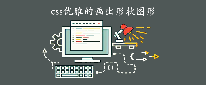
码云笔记 css优雅的画出形状图形
CSS 可以制作出各种我们日常需要的形状。比如说正方形和矩形制作就很简单,添加一个宽度和高度,就得到了所需的矩形大小。如果我们再给它添加一个 border-radius 属性,你就可以把这些矩形变成圆形和椭圆形。当然我们还可以用 CSS 中的伪元素::before 和::after,使我们可以在原始元素中添加另外两个形状。通过巧妙地定位、转换和其他技巧,我们可以只用一个 HTML 元素在 CSS 中创建许多形状。有了这中 css 的形状写法好处当然是很多,我们不用在找美工妹子为我们设计那么多图片,只要我们喜欢愿意就可以几行代码搞定需要的形状,这样我们的网页打开速度也快了。好了,废话不多说,步入正题吧。
正方形

HTML 代码:
<div class="square "></div>
CSS 代码:
.square{
    width: 100px;
    height: 100px;
    background: red;
}
矩形
HTML 代码:
<div class="rectangle"></div>
CSS 代码:
.rectangle {
    width: 200px;
    height: 100px;
    background: red;
}
圆
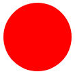
HTML 代码:
<div class="circle"></div>
CSS 代码:
.circle {
    width: 100px;
    height: 100px;
    background: red;
    border-radius: 50%
}
椭圆

HTML 代码:
<div class="oval"></div>
CSS 代码:
.oval{
    width: 200px;
    height: 100px;
    background: red;
    border-radius: 100px / 50px;
}
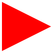
正三角

HTML 代码:
<div class="triangle-up"></div>
CSS 代码:
.triangle-up{
    width: 0;
    height: 0;
    border-left: 50px solid transparent;
    border-right: 50px solid transparent;
    border-bottom: 100px solid red;
}
倒三角形
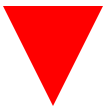
HTML 代码:
<div class="triangle-down"></div>
CSS 代码:
.triangle-down{
    width: 0;
    height: 0;
    border-left: 50px solid transparent;
    border-right: 50px solid transparent;
    border-top: 100px solid red;
}
左三角形

HTML 代码:
<div class="triangle-left"></div>
CSS 代码:
.triangle-left{
    width: 0;
    height: 0;
    border-top: 50px solid transparent;
    border-right: 100px solid red;
    border-bottom: 50px solid transparent;
}
右三角形
HTML 代码:
<div class="triangle-right"></div>
CSS 代码:
.triangle-right{
    width: 0;
    height: 0;
    border-top: 50px solid transparent;
    border-left: 100px solid red;
    border-bottom: 50px solid transparent;
}
三角形左上角
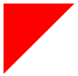
HTML 代码:
<div class="triangle-topleft"></div>
CSS 代码:
.triangle-topleft{
    width: 0;
    height: 0;
    border-top: 100px solid red;
    border-right: 100px solid transparent;
}
三角形右上角
HTML 代码:
<div class="triangle-topright"></div>
CSS 代码:
.triangle-topright{
    width: 0;
    height: 0;
    border-top: 100px solid red;
    border-left: 100px solid transparent;
}
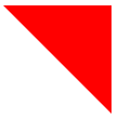
三角形左下角

HTML 代码:
<div class="triangle-bottomleft"></div>
CSS 代码:
.triangle-bottomleft{
    width: 0;
    height: 0;
    border-bottom: 100px solid red;
    border-right: 100px solid transparent;
}
三角形右下角
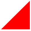
HTML 代码:
<div class="triangle-bottomright"></div>
CSS 代码:
.triangle-bottomright{
    width: 0;
    height: 0;
    border-bottom: 100px solid red;
    border-left: 100px solid transparent;
}
弯曲的尾羽
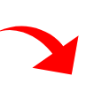
HTML 代码:
<div class="curvedarrow"></div>
CSS 代码:
.curvedarrow {
position: relative;
width: 0;
height: 0;
border-top: 9px solid transparent;
border-right: 9px solid red;
transform: rotate(10deg);
}
.curvedarrow:after {
content: "";
position: absolute;
border: 0 solid transparent;
border-top: 3px solid red;
border-radius: 20px 0 0 0;
top: -12px;
left: -9px;
width: 12px;
height: 12px;
transform: rotate(45deg);
}
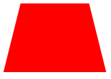
梯形

HTML 代码:
<div class="trapezoid"></div>
CSS 代码:
.trapezoid {
border-bottom: 100px solid red;
border-left: 25px solid transparent;
border-right: 25px solid transparent;
height: 0;
width: 100px;
}
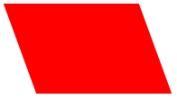
平行四边形
HTML 代码:
<div class="parallelogram"></div>
CSS 代码:
.parallelogram {
width: 150px;
height: 100px;
transform: skew(20deg);
background: red;
}
六角形
HTML 代码:
<div class="star-six"></div>
CSS 代码:
.star-six {
width: 0;
height: 0;
border-left: 50px solid transparent;
border-right: 50px solid transparent;
border-bottom: 100px solid red;
position: relative;
}
.star-six:after {
width: 0;
height: 0;
border-left: 50px solid transparent;
border-right: 50px solid transparent;
border-top: 100px solid red;
position: absolute;
content: "";
top: 30px;
left: -50px;
}
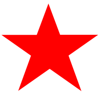
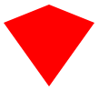
五角形
HTML 代码:
<div class="star-five"></div>
CSS 代码:
.star-five {
margin: 50px 0;
position: relative;
display: block;
color: red;
width: 0px;
height: 0px;
border-right: 100px solid transparent;
border-bottom: 70px solid red;
border-left: 100px solid transparent;
transform: rotate(35deg);
}
.star-five:before {
border-bottom: 80px solid red;
border-left: 30px solid transparent;
border-right: 30px solid transparent;
position: absolute;
height: 0;
width: 0;
top: -45px;
left: -65px;
display: block;
content: '';
transform: rotate(-35deg);
}
.star-five:after {
position: absolute;
display: block;
color: red;
top: 3px;
left: -105px;
width: 0px;
height: 0px;
border-right: 100px solid transparent;
border-bottom: 70px solid red;
border-left: 100px solid transparent;
transform: rotate(-70deg);
content: '';
}
五边形
HTML 代码:
<div class="pentagon"></div>
CSS 代码:
.pentagon {
position: relative;
width: 54px;
box-sizing: content-box;
border-width: 50px 18px 0;
border-style: solid;
border-color: red transparent;
}
.pentagon:before {
content: "";
position: absolute;
height: 0;
width: 0;
top: -85px;
left: -18px;
border-width: 0 45px 35px;
border-style: solid;
border-color: transparent transparent red;
}
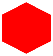
六边形
HTML 代码:
<div class="hexagon"></div>
CSS 代码:
.hexagon {
width: 100px;
height: 55px;
background: red;
position: relative;
}
.hexagon:before {
content: "";
position: absolute;
top: -25px;
left: 0;
width: 0;
height: 0;
border-left: 50px solid transparent;
border-right: 50px solid transparent;
border-bottom: 25px solid red;
}
.hexagon:after {
content: "";
position: absolute;
bottom: -25px;
left: 0;
width: 0;
height: 0;
border-left: 50px solid transparent;
border-right: 50px solid transparent;
border-top: 25px solid red;
}
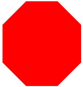
八边形
HTML 代码:
<div class="octagon"></div>
CSS 代码:
.octagon{
width: 250px;
height: 120px;
background-color: red;
margin: 150px auto;
position: relative;
}
.octagon:before{
content: "";
position: absolute;
top:-75px;
width: 100px;
border-color:transparent transparent red transparent;
border-width:0 75px 75px 75px ;
border-style: solid;
}
.octagon:after{
content: "";
position: absolute;
top:120px;
width: 100px;
border-color:red transparent transparent transparent;
border-width: 75px 75px 0 75px ;
border-style: solid;
}
红心
HTML 代码:
<div class="heart"></div>
CSS 代码:
.heart {
position: relative;
width: 100px;
height: 90px;
}
.heart:before,
.heart:after {
position: absolute;
content: "";
left: 50px;
top: 0;
width: 50px;
height: 80px;
background: red;
border-radius: 50px 50px 0 0;
transform: rotate(-45deg);
transform-origin: 0 100%;
}
.heart:after {
left: 0;
transform: rotate(45deg);
transform-origin: 100% 100%;
}
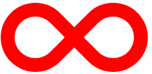
无穷大(躺着的 8)
HTML 代码:
<div class="infinity"></div>
CSS 代码:
.infinity {
position: relative;
width: 212px;
height: 100px;
box-sizing: content-box;
}
.infinity:before,
.infinity:after {
content: "";
box-sizing: content-box;
position: absolute;
top: 0;
left: 0;
width: 60px;
height: 60px;
border: 20px solid red;
border-radius: 50px 50px 0 50px;
transform: rotate(-45deg);
}
.infinity:after {
left: auto;
right: 0;
border-radius: 50px 50px 50px 0;
transform: rotate(45deg);
}
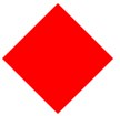
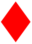
钻石广场
HTML 代码:
<div class="diamond"></div>
CSS 代码:
.diamond {
width: 0;
height: 0;
border: 50px solid transparent;
border-bottom-color: red;
position: relative;
top: -50px;
}
.diamond:after {
content: '';
position: absolute;
left: -50px;
top: 50px;
width: 0;
height: 0;
border: 50px solid transparent;
border-top-color: red;
}
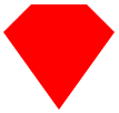
钻石的盾牌
HTML 代码:
<div class="diamond-shield"></div>
CSS 代码:
.diamond-shield {
width: 0;
height: 0;
border: 50px solid transparent;
border-bottom: 20px solid red;
position: relative;
top: -50px;
}
.diamond-shield:after {
content: '';
position: absolute;
left: -50px;
top: 20px;
width: 0;
height: 0;
border: 50px solid transparent;
border-top: 70px solid red;
}
钻石狭窄
HTML 代码:
<div class="diamond-narrow"></div>
CSS 代码:
.diamond-narrow {
width: 0;
height: 0;
border: 50px solid transparent;
border-bottom: 70px solid red;
position: relative;
top: -50px;
}
.diamond-narrow:after {
content: '';
position: absolute;
left: -50px;
top: 70px;
width: 0;
height: 0;
border: 50px solid transparent;
border-top: 70px solid red;
}
切割钻石
HTML 代码:
<div class="cut-diamond"></div>
CSS 代码:
.cut-diamond {
border-style: solid;
border-color: transparent transparent red transparent;
border-width: 0 25px 25px 25px;
height: 0;
width: 50px;
box-sizing: content-box;
position: relative;
margin: 20px 0 50px 0;
}
.cut-diamond:after {
content: "";
position: absolute;
top: 25px;
left: -25px;
width: 0;
height: 0;
border-style: solid;
border-color: red transparent transparent transparent;
border-width: 70px 50px 0 50px;
}
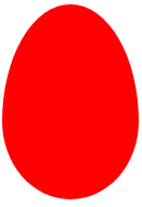
鸡蛋
HTML 代码:
<div class="egg"></div>
CSS 代码:
.egg {
display: block;
width: 126px;
height: 180px;
background-color: red;
border-radius: 50% 50% 50% 50% / 60% 60% 40% 40%;
}
吃豆人
HTML 代码:
<div class="pacman"></div>
CSS 代码:
.pacman {
width: 0px;
height: 0px;
border-right: 60px solid transparent;
border-top: 60px solid red;
border-left: 60px solid red;
border-bottom: 60px solid red;
border-top-left-radius: 60px;
border-top-right-radius: 60px;
border-bottom-left-radius: 60px;
border-bottom-right-radius: 60px;
}
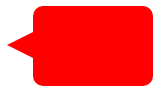
对话泡泡
HTML 代码:
<div class="talkbubble"></div>
CSS 代码:
.talkbubble {
width: 120px;
height: 80px;
background: red;
position: relative;
-moz-border-radius: 10px;
-webkit-border-radius: 10px;
border-radius: 10px;
}
.talkbubble:before {
content: "";
position: absolute;
right: 100%;
top: 26px;
width: 0;
height: 0;
border-top: 13px solid transparent;
border-right: 26px solid red;
border-bottom: 13px solid transparent;
}
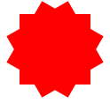
12 角形
HTML 代码:
<div class="burst-12"></div>
CSS 代码:
.burst-12 {
background: red;
width: 80px;
height: 80px;
position: relative;
text-align: center;
}
.burst-12:before,
.burst-12:after {
content: "";
position: absolute;
top: 0;
left: 0;
height: 80px;
width: 80px;
background: red;
}
.burst-12:before {
transform: rotate(30deg);
}
.burst-12:after {
transform: rotate(60deg);
}
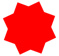
8 角形
HTML 代码:
<div class="burst-8"></div>
CSS 代码:
.burst-8 {
background: red;
width: 80px;
height: 80px;
position: relative;
text-align: center;
transform: rotate(20deg);
}
.burst-8:before {
content: "";
position: absolute;
top: 0;
left: 0;
height: 80px;
width: 80px;
background: red;
transform: rotate(135deg);
}
阴阳图
HTML 代码:
<div class="yin-yang"></div>
CSS 代码:
.yin-yang {
width: 96px;
box-sizing: content-box;
height: 48px;
background: #eee;
border-color: red;
border-style: solid;
border-width: 2px 2px 50px 2px;
border-radius: 100%;
position: relative;
}
.yin-yang:before {
content: "";
position: absolute;
top: 50%;
left: 0;
background: #eee;
border: 18px solid red;
border-radius: 100%;
width: 12px;
height: 12px;
box-sizing: content-box;
}
.yin-yang:after {
content: "";
position: absolute;
top: 50%;
left: 50%;
background: red;
border: 18px solid #eee;
border-radius: 100%;
width: 12px;
height: 12px;
box-sizing: content-box;
}
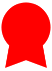
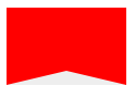
徽章丝带
HTML 代码:
<div class="badge-ribbon"></div>
CSS 代码:
.badge-ribbon {
position: relative;
background: red;
height: 100px;
width: 100px;
border-radius: 50px;
}
.badge-ribbon:before,
.badge-ribbon:after {
content: '';
position: absolute;
border-bottom: 70px solid red;
border-left: 40px solid transparent;
border-right: 40px solid transparent;
top: 70px;
left: -10px;
transform: rotate(-140deg);
}
.badge-ribbon:after {
left: auto;
right: -10px;
transform: rotate(140deg);
}
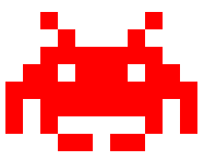
太空入侵者
HTML 代码:
<div class="space-invader"></div>
CSS 代码:
.space-invader {
box-shadow: 0 0 0 1em red,
0 1em 0 1em red,
-2.5em 1.5em 0 .5em red,
2.5em 1.5em 0 .5em red,
-3em -3em 0 0 red,
3em -3em 0 0 red,
-2em -2em 0 0 red,
2em -2em 0 0 red,
-3em -1em 0 0 red,
-2em -1em 0 0 red,
2em -1em 0 0 red,
3em -1em 0 0 red,
-4em 0 0 0 red,
-3em 0 0 0 red,
3em 0 0 0 red,
4em 0 0 0 red,
-5em 1em 0 0 red,
-4em 1em 0 0 red,
4em 1em 0 0 red,
5em 1em 0 0 red,
-5em 2em 0 0 red,
5em 2em 0 0 red,
-5em 3em 0 0 red,
-3em 3em 0 0 red,
3em 3em 0 0 red,
5em 3em 0 0 red,
-2em 4em 0 0 red,
-1em 4em 0 0 red,
1em 4em 0 0 red,
2em 4em 0 0 red;
background: red;
width: 1em;
height: 1em;
overflow: hidden;
margin: 50px 0 70px 65px;
}
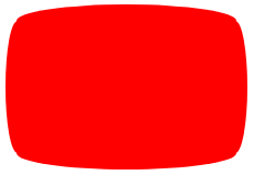
电视屏幕
HTML 代码:
<div class="tv"></div>
CSS 代码:
.tv {
position: relative;
width: 200px;
height: 150px;
margin: 20px 0;
background: red;
border-radius: 50% / 10%;
color: white;
text-align: center;
text-indent: .1em;
}
.tv:before {
content: '';
position: absolute;
top: 10%;
bottom: 10%;
right: -5%;
left: -5%;
background: inherit;
border-radius: 5% / 50%;
}
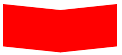
v 形臂章
HTML 代码:
<div class="chevron"></div>
CSS 代码:
.chevron {
position: relative;
text-align: center;
padding: 12px;
margin-bottom: 6px;
height: 60px;
width: 200px;
}
.chevron:before {
content: '';
position: absolute;
top: 0;
left: 0;
height: 100%;
width: 51%;
background: red;
transform: skew(0deg, 6deg);
}
.chevron:after {
content: '';
position: absolute;
top: 0;
right: 0;
height: 100%;
width: 50%;
background: red;
transform: skew(0deg, -6deg);
}
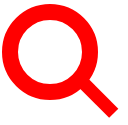
放大镜
HTML 代码:
<div class="magnifying-glass"></div>
CSS 代码:
.magnifying-glass {
font-size: 10em;
display: inline-block;
width: 0.4em;
box-sizing: content-box;
height: 0.4em;
border: 0.1em solid red;
position: relative;
border-radius: 0.35em;
}
.magnifying-glass:before {
content: "";
display: inline-block;
position: absolute;
right: -0.25em;
bottom: -0.1em;
border-width: 0;
background: red;
width: 0.35em;
height: 0.08em;
transform: rotate(45deg);
}
Facebook 的图标
HTML 代码:
<div class="facebook-icon"></div>
CSS 代码:
.facebook-icon {
background: red;
text-indent: -999em;
width: 100px;
height: 110px;
box-sizing: content-box;
border-radius: 5px;
position: relative;
overflow: hidden;
border: 15px solid red;
border-bottom: 0;
}
.facebook-icon:before {
content: "/20";
position: absolute;
background: red;
width: 40px;
height: 90px;
bottom: -30px;
right: -37px;
border: 20px solid #eee;
border-radius: 25px;
box-sizing: content-box;
}
.facebook-icon:after {
content: "/20";
position: absolute;
width: 55px;
top: 50px;
height: 20px;
background: #eee;
right: 5px;
box-sizing: content-box;
}
月亮
HTML 代码:
<div class="moon"></div>
CSS 代码:
.moon {
width: 80px;
height: 80px;
border-radius: 50%;
box-shadow: 15px 15px 0 0 red;
}
标记
HTML 代码:
<div class="flag "></div>
CSS 代码:
.flag {
width: 110px;
height: 56px;
box-sizing: content-box;
padding-top: 15px;
position: relative;
background: red;
color: white;
font-size: 11px;
letter-spacing: 0.2em;
text-align: center;
text-transform: uppercase;
}
.flag:after {
content: "";
position: absolute;
left: 0;
bottom: 0;
width: 0;
height: 0;
border-bottom: 13px solid #eee;
border-left: 55px solid transparent;
border-right: 55px solid transparent;
}
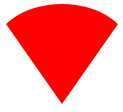
圆锥体
HTML 代码:
<div class="cone"></div>
CSS 代码:
.cone {
width: 0;
height: 0;
border-left: 70px solid transparent;
border-right: 70px solid transparent;
border-top: 100px solid red;
border-radius: 50%;
}
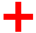
十字架
HTML 代码:
<div class="cross"></div>
CSS 代码:
.cross {
background: red;
height: 100px;
position: relative;
width: 20px;
}
.cross:after {
background: red;
content: "";
height: 20px;
left: -40px;
position: absolute;
top: 40px;
width: 100px;
}
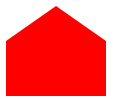
堡垒
HTML 代码:
<div class="base"></div>
CSS 代码:
.base {
background: red;
display: inline-block;
height: 55px;
margin-left: 20px;
margin-top: 55px;
position: relative;
width: 100px;
}
.base:before {
border-bottom: 35px solid red;
border-left: 50px solid transparent;
border-right: 50px solid transparent;
content: "";
height: 0;
left: 0;
position: absolute;
top: -35px;
width: 0;
}
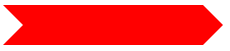
方向指示
HTML 代码:
<div class="pointer"></div>
CSS 代码:
.pointer {
width: 200px;
height: 40px;
position: relative;
background: red;
}
.pointer:after {
content: "";
position: absolute;
left: 0;
bottom: 0;
width: 0;
height: 0;
border-left: 20px solid white;
border-top: 20px solid transparent;
border-bottom: 20px solid transparent;
}
.pointer:before {
content: "";
position: absolute;
right: -20px;
bottom: 0;
width: 0;
height: 0;
border-left: 20px solid red;
border-top: 20px solid transparent;
border-bottom: 20px solid transparent;
}
锁
HTML 代码:
<div class="lock"></div>
CSS 代码:
.lock {
font-size: 8px;
position: relative;
width: 18em;
height: 13em;
border-radius: 2em;
top: 10em;
box-sizing: border-box;
border: 3.5em solid red;
border-right-width: 7.5em;
border-left-width: 7.5em;
margin: 0 0 6rem 0;
}
.lock:before {
content: "";
box-sizing: border-box;
position: absolute;
border: 2.5em solid red;
width: 14em;
height: 12em;
left: 50%;
margin-left: -7em;
top: -12em;
border-top-left-radius: 7em;
border-top-right-radius: 7em;
}
.lock:after {
content: "";
box-sizing: border-box;
position: absolute;
border: 1em solid red;
width: 5em;
height: 8em;
border-radius: 2.5em;
left: 50%;
top: -1em;
margin-left: -2.5em;
}
结束语
以上就是今天为大家带来的如何用 css 优雅的画出形状图形的源码,希望对大家有用,当然有很多图形在实际应用中可能用不到,这里大家就当是参考,学习一下,做到举一反三。
以上关于css优雅的画出形状图形的文章就介绍到这了,更多相关内容请搜索码云笔记以前的文章或继续浏览下面的相关文章,希望大家以后多多支持码云笔记。


 微信
微信 支付宝
支付宝如若内容造成侵权/违法违规/事实不符,请将相关资料发送至 admin@mybj123.com 进行投诉反馈,一经查实,立即处理!
重要:如软件存在付费、会员、充值等,均属软件开发者或所属公司行为,与本站无关,网友需自行判断
码云笔记 » css优雅的画出形状图形


很好的分享,几乎项目中用到的例子都有
多谢,有问题多多交流