
 码云笔记
码云笔记 CSS 中 SVG 渐变边框的应用
在平时开发中,很多时候都会用到SVG。大部分情况我们都不必关注SVG里面到底是什么,直接当成图片资源引入就行,比如常见的图标资源。

我们可以通过多种方式使用这个特殊的图片:
<img src="a.svg">
.icon{
  background: url("a.svg")
}
甚至直接放到HTML中:
<div>
  <svg>
      ...
  </svg>
</div>
这些都没什么问题,但有时候,我们需要的是可以自适应尺寸的,比如像这样的渐变边框,尺寸会随着文本内容的变化而变化,而不是固定尺寸,如下:
或者是这样的虚线渐变边框:

这样的该如何用 SVG 动态实现呢,一起看看吧
一、SVG 导出的局限性
SVG通常不是手写的(能手写任意路径的都是大神),几乎都是设计师借助软件绘制生成的,比如设计都很喜欢的Figma(对前端非常友好,可以尝试一下)。

比如前面提到的渐变边框,在Figma中就是这样:

对于设计师来说,渐变边框很容易,只需要选择边框类型就行了。

对于 CSS 来说,这还算一个比较麻烦的事,通常我们需要额外嵌套一层渐变背景,通过遮盖或者mask裁切的方式实现,有兴趣的可以尝试一下,这里暂不展开。
那么,这个设计可以直接通过导出SVG实现吗?
先试试,Figma中可以直接将这个边框复制成SVG格式

下面是这段复制出来的SVG代码(大概还是能看得懂一些的…)。
<svg width="41" height="25" viewBox="0 0 41 25" fill="none" xmlns="http://www.w3.org/2000/svg">
  <rect x="1" y="1" width="39" height="23" rx="4" stroke="url(#paint0_linear_1_2)" stroke-linecap="round"/>
  <defs>
  <linearGradient id="paint0_linear_1_2" x1="0" y1="0" x2="1" y2="0">
      <stop stop-color="#FFD75A"/>
      <stop offset="1" stop-color="#ED424B"/>
  </linearGradient>
  </defs>
</svg>
我们尝试让这段SVG尺寸跟随button的大小,就行这样:
<style>
  svg{
    position: absolute;
    inset: 0;
  }
</style>
<button>
  CSS
  <svg>...</svg>
</button>
在内容不定的情况下,就变成了这样:

很显然不行,因为生成的SVG宽高是固定的,没法跟随文本内容自适应尺寸
既然 SVG很擅长渐变边框,而 CSS很擅长自适应,那么,有没有取长补短的办法呢?
当然也是有的!不过需要“改造”一下,接着往下看
二、SVG 自适应尺寸
首先我们把上面的那段SVG拿过来。
<svg width="41" height="25" viewBox="0 0 41 25" fill="none" xmlns="http://www.w3.org/2000/svg">
  <rect x="1" y="1" width="39" height="23" rx="4" stroke="url(#paint0_linear_1_2)" stroke-linecap="round"/>
  <defs>
  <linearGradient id="paint0_linear_1_2" x1="0" y1="0" x2="1" y2="0">
      <stop stop-color="#FFD75A"/>
      <stop offset="1" stop-color="#ED424B"/>
  </linearGradient>
  </defs>
</svg>
有没有发现这里很多数值都固定的?如果想实现自适应,我们就需要将这些值改成百分比形式,注意看这个rect,有个x、y坐标,我们现在宽高都是100%了,所以这里的坐标也要改成0,不然就撑出去了。
<svg width="100%" height="100%" viewBox="0 0 100% 100%" fill="none" xmlns="http://www.w3.org/2000/svg">
  <rect x="0" y="0" width="100%" height="100%" rx="4" stroke="url(#paint0_linear_1_2)" stroke-linecap="round"/>
  <defs>
  <linearGradient id="paint0_linear_1_2" x1="0" y1="0" x2="1" y2="0">
      <stop stop-color="#FFD75A"/>
      <stop offset="1" stop-color="#ED424B"/>
  </linearGradient>
  </defs>
</svg>
为了验证这个 SVG的自适应,我们将这个SVG放在一个div中:
<div style="width: 100px;height: 80px;">
  <svg>...</svg>
</div>

<div style="width: 200px;height: 180px;">
  <svg>...</svg>
</div>
效果如下:

是不是已经自适应了?
不过还是有点问题,仔细观察,圆角处有些不自然,感觉被裁剪了一样。

造成这种现象的原因有两个:
SVG描边是居中描边,并且不可修改SVG默认是超出隐藏的,也就是自带overflow:hidden
我们把边框改大一点就可以很明显的观察到描边是居中的:

由于是居中的,所以在不做修改的情况下,我们看到的其实只有原边框的一半,利用这个原理我们其实可以实现常说的0.5px边框。
在这里,我再介绍一种新的方式,那就是利用 CSS calc !
没错,在 SVG中也可以使用CSS函数,比如我们这里边框是4px,那么坐标x、y就应该是2,然后宽高应该是calc(100% - 4px),所以可以很自然的改成这样。
<div style="width: 100px;height: 80px;">
  <svg width="100%" height="100%">
    <rect x="2" y="2" width="100%" height="100%" style="width: calc(100% - 4px);height: calc(100% - 4px);"  rx="4" stroke="url(#paint0_linear_1_2)" stroke-width="4" stroke-linecap="round"/>
     <defs>
    <linearGradient id="paint0_linear_1_2" x1="0" y1="0" x2="1" y2="0">
      <stop stop-color="#FFD75A"/>
      <stop offset="1" stop-color="#ED424B"/>
    </linearGradient>
    </defs>
  </svg>
</div>
非常完美了,不会有任何裁剪!(大家也可以复制上面这段代码放在 HTML 中验证):

这样就“轻易”实现了SVG的尺寸自适应。
这里小结一下:
- 将
SVG的尺寸改为`百分比; - 由于是居中描边,所以要修正一下坐标和大小。
除此之外,还能直接加上style样式,就像这样:
<svg width="100%" height="100%" viewBox="0 0 100% 100%" fill="none" xmlns="http://www.w3.org/2000/svg">
  <style>
    rect{
      width: calc(100% - 4px);
      height: calc(100% - 4px);
    }
  </style>
  <rect x="2" y="2" width="100%" height="100%" rx="4" stroke="url(#paint0_linear_1_2)" stroke-width="4" stroke-linecap="round"/>
  <defs>
    <linearGradient id="paint0_linear_1_2" x1="0" y1="0" x2="1" y2="0">
      <stop stop-color="#FFD75A"/>
      <stop offset="1" stop-color="#ED424B"/>
    </linearGradient>
  </defs>
</svg>
虽然看着多,但后面作用更大,可以添加更多的 CSS 样式
三、SVG 在 HTML 中的应用
其实前面的这段 SVG 可以直接放到 HTML 中用了,比如:
<button>
  <svg width="100%" height="100%" fill="none" xmlns="http://www.w3.org/2000/svg">
    <rect x="2" y="2" width="100%" height="100%" style="width: calc(100% - 4px);height: calc(100% - 4px);" rx="16" stroke-width="2" stroke="url(#paint0_linear_3269_5233)"/>
    <defs>
      <linearGradient id="paint0_linear_3269_5233" x1="0" y1="0" x2="100%" y2="100%" gradientUnits="userSpaceOnUse">
        <stop stop-color="#FFD75A"/>
        <stop offset="1" stop-color="#ED424B"/>
      </linearGradient>
    </defs>
  </svg>
  CSS
</button>
我们需要将这个 SVG撑满整个button,所以可以直接绝对定位:
button{
  position: relative;
}
button>svg{
  position: absolute;
  inset: 0;
}
这样就得到了一个自适应尺寸的、带有渐变边框的按钮,效果如下:

四、SVG 在 CSS 中的应用
不知道你有没有这样的感觉,把一大段 SVG放在 HTML不是特别优雅,总觉得太臃肿了。
如果你有这种感觉,不妨将这段 SVG转换成内联CSS代码。
在这里可以借助张鑫旭老师的这个工具:SVG 在线压缩合并工具

我们将这段SVG粘贴过去,可以得到这样的一段内联SVG:
data:image/svg+xml,%3Csvg fill='none' xmlns='http://www.w3.org/2000/svg'%3E%3Crect x='1' y='1' width='100%25' height='100%25' style='width:calc(100%25 - 2px);height:calc(100%25 - 2px)' rx='16' stroke-width='2' stroke='url(%23paint0_linear_3269_5233)'/%3E%3Cdefs%3E%3ClinearGradient id='paint0_linear_3269_5233' y2='100%25' gradientUnits='userSpaceOnUse'%3E%3Cstop stop-color='%23FFD75A'/%3E%3Cstop offset='1' stop-color='%23ED424B'/%3E%3C/linearGradient%3E%3C/defs%3E%3C/svg%3E
有了这段内联SVG,我们可以直接用在background背景上:
button{
  background: url("data:image/svg+xml,%3Csvg fill='none' xmlns='http://www.w3.org/2000/svg'%3E%3Crect x='1' y='1' width='100%25' height='100%25' style='width:calc(100%25 - 2px);height:calc(100%25 - 2px)' rx='16' stroke-width='2' stroke='url(%23paint0_linear_3269_5233)'/%3E%3Cdefs%3E%3ClinearGradient id='paint0_linear_3269_5233' y2='100%25' gradientUnits='userSpaceOnUse'%3E%3Cstop stop-color='%23FFD75A'/%3E%3Cstop offset='1' stop-color='%23ED424B'/%3E%3C/linearGradient%3E%3C/defs%3E%3C/svg%3E")
}
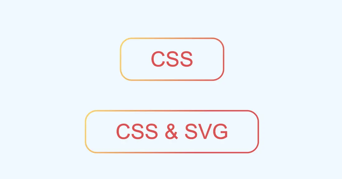
而HTML只需要干净的button元素就够了。
<button>CSS</button>
<button>CSS & SVG</button>
神奇的是,即便是转为内联了,SVG仍然保持着自适应特性,这样也能实现同样的效果,是不是好多了?
你也可以访问在线链接:button with SVG background‘)
五、SVG 的独特魅力
如果说上面的效果 CSS 还能勉强模拟一下,那如果是这样的虚线呢?

对于 SVG 就非常容易了,只需要设置stroke-dasharray属性就行,并且可以随意更改虚线的间隔。
<svg width="100%" height="100%" fill="none" xmlns="http://www.w3.org/2000/svg">
  <rect x="2" y="2" width="100%" height="100%" style="width: calc(100% - 4px);height: calc(100% - 4px);" rx="16" stroke-width="2" stroke="url(#paint0_linear_3269_5233)"  stroke-dasharray="8 4"/>
  <defs>
    <linearGradient id="paint0_linear_3269_5233" x1="0" y1="0" x2="100%" y2="100%" gradientUnits="userSpaceOnUse">
      <stop stop-color="#FFD75A"/>
      <stop offset="1" stop-color="#ED424B"/>
    </linearGradient>
  </defs>
</svg>
还有这种虚线边缘是圆角的情况,CSS就更加无能为力了。

SVG只需要设置stroke-linecap就行。
<svg width="100%" height="100%" fill="none" xmlns="http://www.w3.org/2000/svg">
  <rect x="2" y="2" width="100%" height="100%" style="width: calc(100% - 4px);height: calc(100% - 4px);" stroke-width="2" rx="16" stroke-linecap="round"  stroke="url(#paint0_linear_3269_5233)"  stroke-dasharray="8 6"/>
  <defs>
    <linearGradient id="paint0_linear_3269_5233" x1="0" y1="0" x2="100%" y2="100%" gradientUnits="userSpaceOnUse">
      <stop stop-color="#FFD75A"/>
      <stop offset="1" stop-color="#ED424B"/>
    </linearGradient>
  </defs>
</svg>
更进一步,SVG还能实现虚线滚动动画,CSS 应该是实现不了了。
看似复杂,其实只需要改变stroke-dashoffset属性就行了,我们可以直接在SVG中插入CSS动画。
<svg width="100%" height="100%" fill="none" xmlns="http://www.w3.org/2000/svg">
  <style>
    .rect{
      width: calc(100% - 4px);
      height: calc(100% - 4px);
      animation: move .3s infinite linear;
    }
    @keyframes move {
      0% { stroke-dashoffset: 0; }
      100% { stroke-dashoffset: 14; }
    }
  </style>
  <rect class="rect" x="2" y="2" width="100%" height="100%" stroke-width="2" rx="16" stroke-linecap="round"  stroke="url(#paint0_linear_3269_5233)"  stroke-dasharray="8 6"/>
  <defs>
    <linearGradient id="paint0_linear_3269_5233" x1="0" y1="0" x2="100%" y2="100%" gradientUnits="userSpaceOnUse">
      <stop stop-color="#FFD75A"/>
      <stop offset="1" stop-color="#ED424B"/>
    </linearGradient>
  </defs>
</svg>
所有情况都可以将 SVG转为内联CSS直接用在背景上,极大的保证了HTML的简洁性
你也可以访问在线链接:dot border with animation
六、总结一下
以上就是本文的全部内容了,主要介绍了如何利用 SVG和CSS各种的优势来实现更加灵活的布局,下面总结一下
- 设计软件导出的
SVG都是固定尺寸的,不能自适应尺寸 SVG很擅长渐变边框,而CSS很擅长自适应尺寸,得想办法取长补短SVG部分属性支持百分比类型,可以实现尺寸自适应SVG描边是居中描边,并且不可修改,所以需要调整圆角矩形的坐标的大小SVG中也支持CSS部分特性,比如calc计算函数SVG还支持内嵌style标签,直接插入CSS代码- 可以将
SVG转为内联CSS代码,在支持SVG特性的同时极大的保证了HTML的整洁 - 借助
SVG可以很轻松的实现渐变虚线边框 SVG中还支持CSS动画,可以实现虚线滚动动画
你可能已经发现SVG并不是非常孤立的一门语言,现在还能和 CSS、HTML联动起来,充分发挥各自的优势,这样才能事半功倍 。
原文:链接
以上关于CSS 中 SVG 渐变边框的应用的文章就介绍到这了,更多相关内容请搜索码云笔记以前的文章或继续浏览下面的相关文章,希望大家以后多多支持码云笔记。
 微信
微信 支付宝
支付宝如若内容造成侵权/违法违规/事实不符,请将相关资料发送至 admin@mybj123.com 进行投诉反馈,一经查实,立即处理!
重要:如软件存在付费、会员、充值等,均属软件开发者或所属公司行为,与本站无关,网友需自行判断
码云笔记 » CSS 中 SVG 渐变边框的应用


